
Offering substitution preferences for out-of stock items
Context
In 2021, Grubhub expanded into grocery and convenience ordering, which required drivers to shop in-store for items. However, the inventory data we received didn’t update in real time, so items listed as available were frequently out of stock by the time drivers went to find them.
Problem
Compared to restaurant orders, these new order types saw three times higher rates of missing items, cancellations, and customer support contacts.
Customers were receiving incomplete orders, drivers were losing time and money coordinating with customers and support to make substitution decisions, and Grubhub was absorbing the cost of refunded items.
Goal
To ease frustration, reduce support costs, and prevent delays during shopping, we wanted to give customers a way to proactively set substitution preferences so drivers would know what to do when items were out of stock.
Solution
I was the sole designer of the customer-facing experience across iOS, Android, and Web, working with partners from UX research, UX writing, product, and engineering across our customer and driver teams.
I designed a flow that:
Kept users engaged post-checkout, turning what was usually a stopping point into a guided next step
Offered optionality without causing decision fatigue
Made it clear to customers what they would receive and how much they’d be charged
50% reduction in cancellations
Within six months, cancellations for grocery and convenience store orders were cut in half

Impact
$622K annual savings
Reduced cancellations and refunds saved the company an estimated $622,000 per year

STEP 1
Understanding the competitive landscape
To help familiarize myself with the space and understand what mental models may already exist for managing out-of-stock items, I began with a competitive audit of similar grocery and food delivery services.
My findings stressed the importance of removing unnecessary interactions and making final order details clearer.
Pre-checkout
EXAMPLE FLOW
Substitution preferences were usually selected at the individual item level, as items were added to the cart
Most default preferences were designed to save the order and reduce contacts when possible (i.e. choose best available)
During shopping
EXAMPLE FLOW
Shoppers relied on in-app messaging to confirm what action should be taken, regardless of preferences set before checkout
Post-shopping
EXAMPLE FLOW
None of the receipts did a good job of showing the replacement items that were purchased, which led to confusion over the final order total
Only some of the services provided an alert or notification when items were unavailable, leading to surprises once orders arrived
Considering both user experiences
STEP 2
My next step was planning and facilitating a cross-team mapping workshop where product, design, and engineering partners worked together to align on an ideal end-to-end flow: from the customer building a cart, to the driver shopping for the order, to the order being received.
Our UX research team had already conducted interviews with both customers and drivers, and two specific insights guided our flow:
Customers tend to “set it and forget it”
Many don’t keep an eye on their phones after their order’s placed, and they often miss communication from drivers
Drivers fear making a wrong choice
They worry that picking a substitution the customer doesn’t like could lead to lower tips or a negative rating
With this in mind, our flow was designed to:
Capture preferences during cart creation
Ensure preferences were accessible and visible throughout the ordering flow
Remove the need for drivers to contact customers during shopping or make choices on their behalf
Designing through constraints
STEP 3
Both the consumer and driver teams walked away from the workshop feeling confident in our vision, and I was excited to begin design exploration. But as we moved forward, a number of constraints emerged that challenged our assumptions, pushed us to adapt, and led us in a new direction.
Focus on profitability
Profitability was a top priority for the business, and there was concern that this feature would add friction to checkout and increase dropoff rates.
To eliminate the risk of conversion loss, product leadership decided that, at least for the initial release, substitution preferences wouldn’t be introduced until after an order was placed
The first constraints came early, which made it easy to pivot and narrow the design scope:
Inability to search for items
The ability for customers to search for specific items as replacements wouldn’t be available for launch due to the back-end engineering resources required.
This meant we would need to find the right balance of surfacing relevant recommendations without causing decision fatigue.
I revised the user flow based on these decisions and determined which interaction patterns would best guide customers into the post-checkout experience and make it easy to select their substitution preferences.
INITIAL EXPLORATIONS:

Two key areas I focused on were:
Structuring and presenting the top-level “replace vs. refund” decision clearly
Leveraging existing item card selection patterns to maintain consistency and minimize engineering effort
As part of this work, I ended up collaborating with the design systems team to introduce a new segmented control component, which streamlined the interaction and made it easier for users to toggle between options.
To avoid overwhelming customers with too many decisions at once, I also wanted to include default substitution options (i.e., Grubhub recommendations). Customers could quickly opt in without selecting specific replacements for every item, and item previews still provided transparency. Framing them as Grubhub’s choices also helped set expectations and eased pressure on drivers.

After weeks of work, including usability testing and design refinement, we were finally able to incorporate our real, back-end data to our internal test site. The results were… disappointing.
Flat recommendations logic
Despite our dependence on showing recommendations to encourage item replacements, resourcing constraints meant we could only generate basic recommendations based on item name category vs. a smarter engine that could incorporate item-specific criteria (e.g., fat percentage for milk vs. strength for medication), order contents, or past purchases.
We knew this wasn’t ideal, but what we didn’t realize was how few recommendations it would actually yield.
This was a major change, and I worked closely with the driver team to rethink the experience and minimize pain points as much as possible. One example of this is advocating for and ensuring we had fallback actions in place for drivers if a customer didn’t respond, so they wouldn’t be stuck making decisions on the customer’s behalf.
After presenting and discussing options with product and design leadership, we made the difficult decision to include a “contact me” option, prioritizing business needs while giving drivers the ability to offer in-store alternatives beyond our in-app recommendations.
Incorporating feedback and finalizing details
STEP 4
Alongside stakeholder reviews, I built interactive prototypes and ran multiple rounds of user testing to validate usability and comprehension, refining the content and flow along the way.
I then worked alongside engineering to review builds, work through error states and edge cases, and ensure everything looked and worked as intended in my design specifications.

Launching the new flow!
STEP 5
Creating a seamless entry point and keeping customers engaged
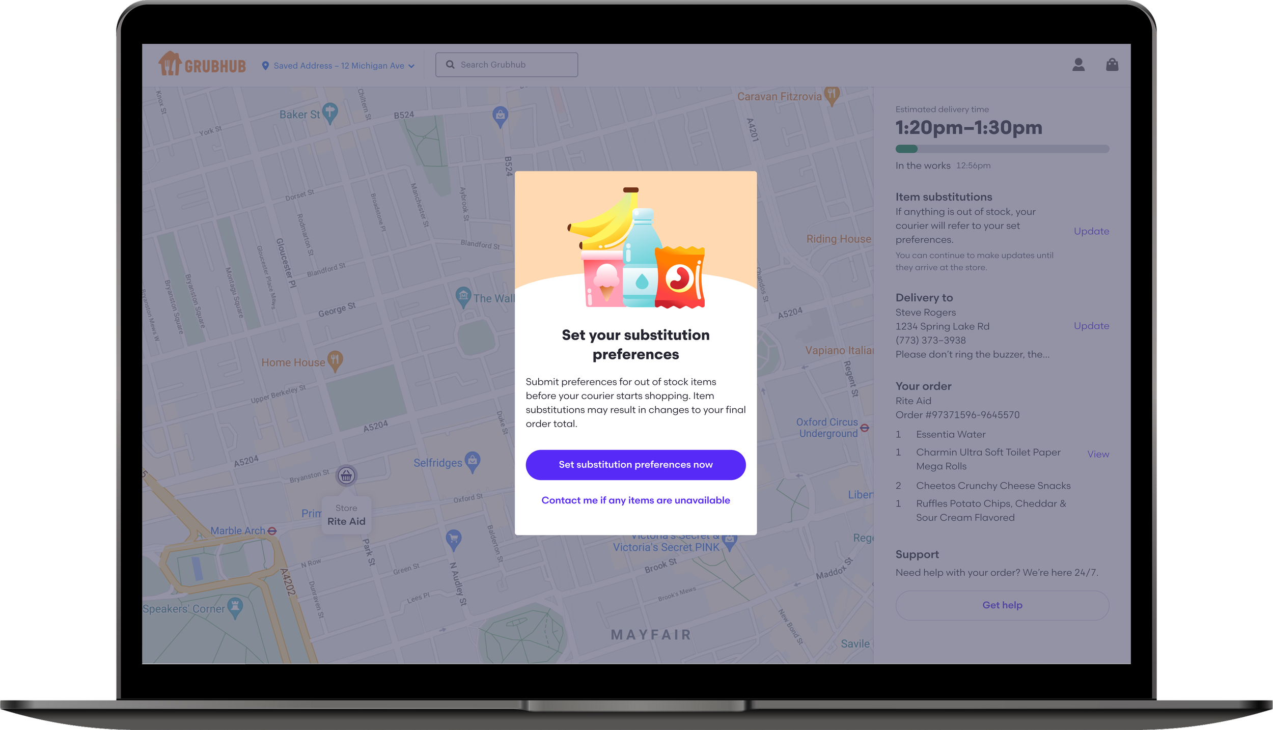
Customers are prompted to set preferences immediately after their order is placed and before order tracking is accessible, to make it feel like the next step in the checkout process.
Providing optionality that encourages replacements, without overwhelming
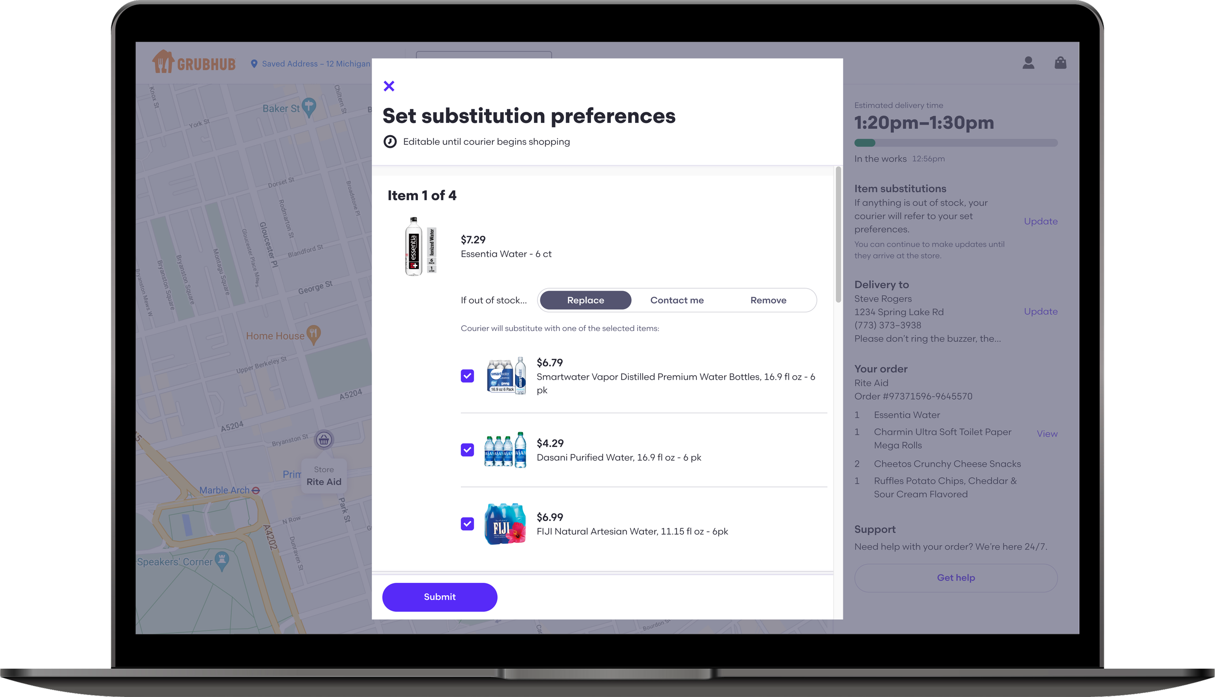
Customers have the option to approve specific replacements, request driver contact, or receive a refund for each individual item.
Up to three recommended replacements are provided per item, so the customer has multiple options to choose from but doesn’t feel overwhelmed by choices.

Eliminating guesswork on order receipts
Customers receive a notification once the driver has finished shopping, at which point they can view their order receipt and easily see any substitutions or refunds that were made.
This flow successfully reduced cancellations on grocery and convenience store orders by more than 50%, and led to an estimated annual savings of $622k due to lower refunds and support contacts.

Continued learning
STEP 6
Updates to this flow were deprioritized given its overall success, but in continuting to monitor the data it became clear that there was room for improvement.
Low interaction rates
19% of customers didn’t engage with the flow, highlighting the need to be more proactive in its introduction
Contacts drove cancellations
33% of customers requested driver contact for every item, which led to a higher chance of a cancelled order
If I had the opportunity, I would want to test a variation of the flow that brought customers directly to the substitution preferences page after checkout, instead of relying on them to click into it.
My hypothesis is that this would improve interaction rates while also cutting down the number of customers who requested driver contact for all items, as they wouldn’t see that initial option.
Personal takeaways
This was my first time designing and QAing an entirely new flow across multiple platforms, and the design documentation and engineering handoff were a huge effort. It was also a reminder of the importance of presenting work early and ensuring alignment with leadership from the start. But I’m proud of my adaptability and ongoing collaboration with the driver team to create a cohesive end-to-end flow that balanced the needs of both user types.
Want more details?
Curious to see more of the explorations? Or how I built the prototypes for user testing? Or my meticulous design documentation?
Please reach out! I’d love to share more.
